Feb. 22. 2023
This Week in Logistics

The Fr8app weekly market update, is a report that analyzes data from multiple sources, including but not limited to FreightWaves SONAR, DAT.
We know that market data is vital to making real-time business decisions, and at Fr8app, we are committed to giving you the data you need to better manage your freight.
What is going on in the US market?
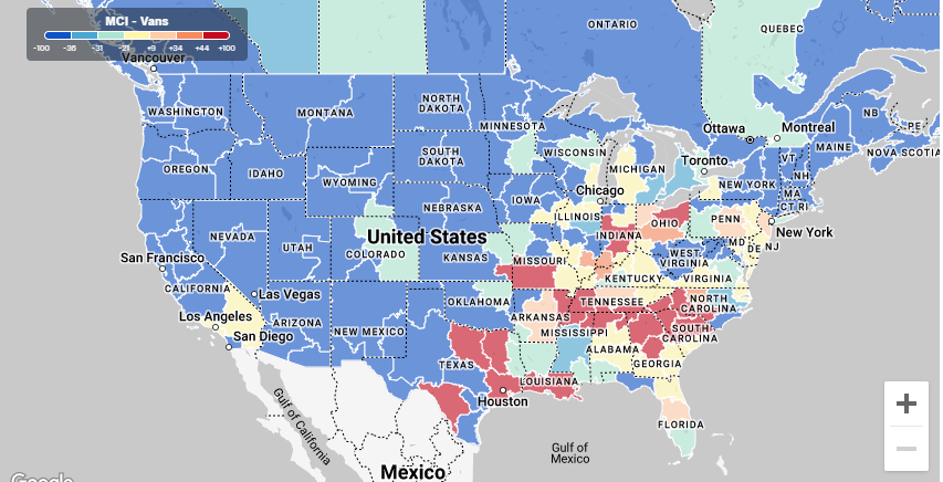
Well firstly there’s a lot going on right now, we are seeing capacity tightening throughout the Southeast and lower Midwest. But we are also seeing California and the rest of the West Coast cool down significantly. Meaning the inbound freight to California is going to become more difficult to cover and rates will increase because of that. Conversely, the Southeast will show rates going lower as it is more desirable for carriers to get to these hotter areas.
Additionally load posts nationally have stayed steady to where they were the previous few weeks. Truck postings have increased by about 5%. All this means we “should” see some more available trucks posted on DAT for coverage. I don’t think it will necessarily directly impact our available capacities for any specific lane; most of these numbers are on a general national level.
What are we still seeing?
There are some areas in parts of the country you will see showing red or hotter on the heat map, with capacity a little tighter:
- In the Western Region of the country, we should have open capacity throughout the market.
- In the Northeast we are seeing Elizabeth, NJ, Harrisburg, PA, Philadelphia, PA and Allentown, PA markets.
- In the Southeast such as Memphis, TN, and Metro Atlanta, GA. In the Northcentral such as the Chicago/Joliet, IL, Grand Rapids, MI, Terre Haute, IN, Indianapolis, IN and all Ohio markets.
- The Southcentral region such as Houston, TX, Dallas, TX and Fort Worth, TX markets show tighter capacity.
Improve now the efficiency of your supply chain.
Book a free consultation with a Fr8App Expert and optimize your results today.
How should I read this map?
- Heat Map shows all markets in the Country and how those markets show where we have capacity rich areas and where we do not. The darker shaded red areas are the “hotter markets” that signifies more freight posted than trucks available in that area. The lighter areas represent more balance in a market for loads per truck.
- Generally, when you are looking at a hotter freight market, carrier rates inflate from demand. You will see increased rates in a more balanced or lighter market.
A good rule of thumb is…
- A lane from a balanced market to hot market will have stabilized rates.
- A lane from Hot market to a balanced market will have increase.
Key Locations with limited capacity
- McAllen, TX 3.6 L/T
- Macon, GA 5.9 L/T
- Fort Worth, TX 4.8 L/T
- Dallas, TX 3.0 L/T
- Laredo, TX 4.4 L/T
Key Locations with available capacity
• Chicago, IL 0.8 L/T
• Ontario, CA 1.3 L/T
• Indiannapolis, IN 2.6 L/T
• Harrisburg, PA 2.2 L/T
Discover exciting stories and get insights from logistics experts.
Join the ultimate Fr8App Insights mailing feed.
